Wednesday 12 September 2012

Design Principles #3 - Getting down to the Rhythm

Rhythm is mentioned by one of my arty farty heros Henri Matisse

An artist must possess Nature. He must identify himself with her rhythm, by efforts that will prepare the mastery which will later enable him to express himself in his own language.
Now Mr. Matisse was taking about paintings but it is equally true about music, poetry or indeed web and app design. We as devs create rhythm by simply repeating elements in predictable or surprising patterns. This repetition is a natural thing that occurs everywhere in our world. As people, we are driven everyday by predictable, timed events. The Olympics every 4 years, telegraph poles along a road, fence posts receeding off down a beach, breakfast coming after gettting out of bed.

Rhythm in design is just re-creating that, re-creating these predictable timed patterns, creating a pleasing sub-conscience relationship between the elements in the pattern.

Humans are designed to seek for and recognise patterns being able to recognise a sabre tooth tiger was a definite advantage to our hairy anchestors!. Patterns are familar and are reasuring to the user, unordered chaos (the opposite of rhythm) jars and unsettles the viewer and should be avoided - unless that IS what you were looking to achieve ;-)
In your app or web site rhythm creates a sense of movement for the user. A good website shouldn’t feel template based, it should tell a story. The fluctuation or repetition  of key elements on a website express rhythm.

So rhythm - tell me more ... there are 3 types Regular, Progessive and Flowing.

Regular Rhythm
Dead easy ...it just repeats elements in timed or predictable intervals like this .. on Play.com

Button equal sized and horizontal, large main image in the area where the eye naturally gravitates, and "KNOCKOUT DEALS!" slap bang in the hot zone of eye movement. Then four small rectangle panels along the bottom. Even these 4 panels have text on the left similar sized image on the right.

All regular, safe , rhythm!

Beware regular rhythm! It can be ... boringly template looking ... if not done well and with some stylistic flair.

Progressive Rhythm
A progressive pattern used changes in size or colour or possesion but not in a regular way. Progessive patterns lead the eye progressively through the elements. In http://flairbuilder.com/ above the asymmetric circles and dotted thread are perfect examples of a Progressive Rhythm leading the naturally from Circle to Circle right to left.

This is particularly skillful blend of regular rhythm in the navigation and footer and progressive in the center panel. It works visually and that is always the acid test of a good design.

Flowing (or Fluid) Rhythm
A flowing rhythm gives a sense of movement, and is often more organic in nature. Think of the stripes on a Zebra, they are regular white and black stripes but arranged in a fluid almost random way. (The rhythm on a Zebra comes the repeating white and black not the size position or shape.)

Flowing is perhaps the most difficult of the rhythms to get right with elements on the page however you can use it to good advantage with your masthead or footer images, which can give the over all impression of a flowing movement on the page.
... and in this website , the sadly now defunct http://www.aw-digital.com

 .. the dev has used a mixture of regular (the stripes top left) and progressive (the semi circular arc) and fluid with the different sized circles. The combination gives a very pleasing effect. Also note there in the top left quadrant the home button.. right where the eye will settle and there diagonally opposite are the "social" buttons balancing the home button nicely.... Lovely!

Adding unique interest and excitement to your web designs can be hard to accomplish, but adding some rhythm to the design is a quick and easy way to do this.Our own demon drummer Bruce Elgort will tell you that good drumming can be the back bone, anchor and driving force in music and as you can see it can be the same in web and app design! Every design has rhythm even if you didn’t plan for it, so a good dev will  take control of it and use it to the best advantage.

.. and so on to how to do "Emphasis" to your app's best advantage in the next design post


Tuesday 11 September 2012

Design Principles #2 - Proportion

Proprotion - OK why should I care about proportion?

Proportion is closely linked to Balance that I discussed in the previous "Design" post. Proportion is one of the attributes that can balance a page or on the other hand send it spinning off into the realm of things that make you go "EUCK!!!!!"

At it's most basic level, proportion is the relationship that an element has with one or more other elements on the page. This relationship can be any one of the elements attributes size, colour, weight (as described in the previous post) but generally it is the size that we humans look for instinctively.

Think of the human body. If you head was 200% wider but the same height it would odd or more correctly "out of proportion" to the rest of your body. The human eye is used to the "natural" proportions found in nature, so while we will instinctively like things that observe certain rules of proportionality we will also dislike and find upsetting those things that are "out of proportion".

Back in the Renaissance artists and mathematicians noticed that there was a natural proportion that when observed made their pictures, sculptures and buildings better, more pleasing and generally visually wonderful!

After much quill sucking and doodling on the back of Italian Bistro table clothes they came to the astounding discovery that the proportion of "nice looking things" was generally the same. They called this the "Divine Proportion" or "Golden Ratio" and it is 1:1.618033988749895 or if long numbers aren't your cup of tea 1:1.618

Eh?
Have a look at the above statues ... which one looks "in proportion"?

If you said the one in the middle .. well you would be right.. here you have the golden mean in action.. the ratio between each adjoining element is in the proportion 1:1.62 .... see?

Right that works for naked men (and women) but what about web pages or apps?

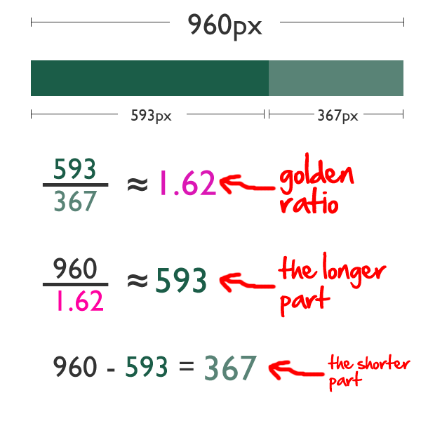
So if you have a page layout that is 906px wide and you want to divide it into two sections that conform to the golden proportion .. easy peasy!


Simple :-)

Still Not convinced... well lets look at twitter.


Look at the boxes.. and how they "fit" the design.. each box is in 1:1:62 with the next biggest element. BTW The spiral is one of the things in nature to look for when looking for the golden ratio.


Right I am going off on a tangent for a moment ..

The Golden Ratio is not quite as fixed a rule as you may think when you start to play around you will discover that you can break the golden ratio if you are careful. There is an optimal number of symbols or characters per line. Generally this is accepted as being 50-60 although up to 75 can be OK. More than this the readers eye wanders off and they loose their place and their interest. Too short and the eye will have to travel back too often, breaking the reader’s rhythm. Too short lines also tend to stress people, making them begin on the next line before finishing the current one (hence skipping potentially important words). SO depending on your typography in your page's elements you can break or at least bend the golden ratio and still provide a balanced design.

There is a very interesting book “Typographie” by E. Ruder that explains a lot about how we read and it seems that the subconscious mind is energized when jumping to the next line as long as it doesn’t happen too frequently. At the beginning of every new line the reader is focused, but this focus gradually wears off over the duration of the line

So with this in mind, sizing your textual elements should combine an optimal line length of between 50 and 60 symbols and nod at the proportions of the golden ratio.

OK Back on proportion

Sine 1:1.618 is pretty close to .33 : 0.66 a variant of the Golden ratio is "The Rule of Thirds" this generally can be used without need for your calculator. All you need to do is divide your design vertically and horizontally into thirds - like a tic-tac-toe board. take this site for example


Now if you remember back to part 1 of this series I pointed out that when people do decide to read a page, their eyes sweep horizontally from left to right, often focusing initially on a roughly triangular area in the upper-left corner. When the results are applied to a page that observes the rule of thirds then we see the following happening.


On the demandware site above you can see that the designer has used the rule of thirds but has nodded at the golden ratio

Also worthy of note in the site example :

1. The picture is placed so the site is in the golden ratio from top to bottom in a similar way to the statue.. the top section is in 1:1.62 to the picture underneath. There is also a golden spiral in there by "weight" in the top 2/3 of the page.


2. The edges of the person's body (not the arms) in the picture runs down the 2/3's line reading left to right or right to left, these are close to the golden ratio and are satisfying to the eye.

3. Whilst the weight of the left hand side is increased by the large ON DEMAND section the page remains in balance because the lower left hand segment is less populated than those on the right so the page remains in balance and is satisfying

4. The package the person is holding is sloped bottom left to top right. This leads the eye up to the navigation panel. Were it the other way around this would drag the eye down to the footer.


..and that is an short introduction to proportion ... another invaluable tool to the designer and will get mentioned again when I talk about "Grids" later in this series.


.. and next we move onto Rhythm ....

Today is a BOFH day .... :-)

Today I got a reply from a user who had received a standard warning message about a password change event that will be happening tomorrow.
The orginal email message reads

Dear xxx,
Please be aware that your password for the userprofile XXXXXXX on the BIGBOX server will expire tomorrow and you will be required to change it.
Regards
The Security Administration Team
We in IT send these messages on the two mornings before password change day so that the change does not come as a surprise and it gives our users 2 days to work out something exciting and memorable that does not break the password composition rules and yet fits on a post-it note attached to their screens.. Names of people and servers changed to protect the guilty.


The Reply
Steve
       What is this about?
Regards
Norbert Normal
My Reply to the reply

Dear Mr Normal
This message is to warn you that your password will expire tomorrow and you will have to change it Here are some useful definitions

"BIGBOX" = A server that has the name BIGBOX you know you are attaching to the BIGBOX server when you click the icon on your desktop named BIGBOX. This opens a windows where in large 70pt friendly blue letters in the center of the screen it says BIGBOX

"Password" = this is a secret word that allows you and you alone to access the facilities on a Computer. In this case the BIGBOX server see 1 above. We use passwords because we like secrets in MIS. Encryption is our bread an butter and passwords our Marmite. We do it specifically to make it difficult for people to do things that they shouldn't do on the server. We have considered removing your keyboards but this was deemed to be too excessive by the User Committee.

"Tomorrow" = a difficult concept, usually considered to be the day after today. But when is today? I generally advise users that tomorrow is the next time you wake up and get out of bed. However if you had a large and perhaps liquid lunch this may lead to confusion. So I suggest you put on your television and tune to BBC1 .. stay awake until you see the next BBC Breakfast program starting and you will have arrived successfully at "tomorrow"

Regards
Steve


Quick Tip for IE Compatibility Modes

After much head scratching on how to get IE9 to behave properly with a web site design I discovered deep in a MS document that you can add this inside your [HEAD] and it will force any IE version to use the highest compatibility mode that is available to it
[meta http-equiv="X-UA-Compatible" content="IE=edge" /]

Damn useful as IE9 will by default start in QUIRKS mode and make a mockery of all your lovely newish CSS and JS.

The MS Article is here

PS I will be back later with Design Principals and Proportionality

Monday 10 September 2012

Design Principles #1 - Balance

So what is "Balance" and why do I give a monkey's chuff?

Well on a very basic level we humans like things to be balanced and something that is visually balanced is more pleasing to the eye than something that is not.

The easiest way is to think of an old fashion set of scales, when the two objects being weighed are the same weight the scales will be balanced. You can have several objects on one side and they still "balance" one big object on the other side.

You will hear design geeks like me say "That panel has too much weight" and basically I am saying the same thing. Visually the panel is heavier than the other elements and is causing the whole effect to be out of balance.

The "weight" of a visual object is made up of its size, color and lightness or darkness. If a visual object on the screen does not "balance" with the other objects on the screen then it drags the viewers eye down to the heaviest part of the screen and you may not be aiming for that effect and it may well detract from the information being presented on other parts of the screen. The weight of an element can be judged using these basic rules.
  • Bigger areas are heavier than smaller areas.
  • Darker areas are heaver than lighter areas.
  • Saturated colors are heavier than unsaturated colors.
  • A stronger border is heavier than no border or a thin one.
  • Texture is heavier than no texture. The denser the texture, the heavier.
  • Colors like red and orange are heavier than calm colors like blue or green.
The human eye is an odd thing it "likes" patterns it can understand easily. The eye understands balance and when faced with something that is out of kilter it will look at the heavy side first as we know that heavy things (in general) carry more importance than light things so in the absence of balance we look for heavy to try and make sense of the imbalance.

We achieve this by scanning a page, painting or website with our eyes looking for balance/imbalance and the thing with the most "Weight". Yahoo! have done some interesting research on tracking the eyes of visitors to various web sites and they have discovered that initially
  • People scan the main (heaviest) part of the page first, this should give us "Context"
  • They make decisions about the page in as little as three seconds based on that scan
  • If they decide to stay, they move their attention to the top half of the screen.
When people do decide to read a page, their eyes sweep horizontally from left to right, often focusing initially on a roughly triangular area in the upper-left corner of a webpage but are dragged towards the "Heavier" parts of the screen or page. Being a designer you can leverage this to your advantage by balancing your page in such a way that you allow your design to lead your users eyes through their visit, both encouraging them to stay and if they do stay making their visit pleasing to look at and use.

There are 3 types of Visual Balance

1. Symmetrical (sometimes called formal) Balance
Symmetrical balance is mirror image balance. If you draw a line down the center of the page, all the objects on one side of the screen are mirrored on the other side (they may not be identical objects, but they are similar in terms of numbers of objects, colors and other elements. Sometimes they are completely identical
Here is a web site that is very nearly completely symmetrical on a vertical access down the middle of the screen. Each side left and right has a similar "weight" and is "balanced".

It is also worthy of note that while the page is balanced Left to Right, it is in a state of imbalance top to bottom. the top is "lighter" and the bottom "heavier". This leads the eye from the top of the page down to the heavier bottom of the page, which is the direction that the designer wants you to take.

Also note the slightly larger tree in the bottom right below "Flexibility", this little bit of imbalance will underline the Flexibility link visually and we will unconsciously be more interested from a visual key in that part of the screen. the designer has done this deliberately to accent the importance they feel in "Flexibility"


2. Asymmetric (Sometimes called Informal) Balance
Asymmetrical balance occurs when several smaller items on one side are balanced by a large item on the other side, or smaller items are placed further away from the center of the screen than larger items. One darker item may need to be balanced by several lighter items.

This example shows an Asymmetric design that it is balanced. The darker right hand panel is smaller that the combined left hand text panels. It is also worthy of note that the eye again is taken from the lighter left most panel through the heavier middle panel and then finally to the left hand heavier panel.


Note in the middle panel the collection of 15 thumnails is at the top.. making the centre column slightly top heavy .. this along with the larger font in the the left hand panel keep the reader's eye in the top half and content rich part of the page.

Although asymmetrical balance may appear more casual and less planned, it is usually harder to to use because the designer must plan the layout very carefully to ensure that it is still balanced. An unbalanced page or screen creates a feeling of tension, as if the page or screen might tip, or things might slide off the side, just as the unbalanced scales would tip to one side.


3. Radial Symmetry
The third type of balance is radial balance, where all elements radiate out from a center point in a circular fashion. It is very easy to maintain a focal point in radial balance, since all the elements lead your eye toward the center.

In this example whilst the designer has nodded at symmetry they have not got it right at all,  the columns are not symmetrical vertically or horizontally. The differences in width are un-balanced, The colours are un-balanced, the lightness/darkness is un-balanced.  You will find your eye scanning up and down left and right in the vain hoping of finding both balance and a place that can be a focus and a place to start.


 So Balance is VERY important in directing your users/visitors to the bits of your app/site you want them to focus on first and then lead them on into content and from their into the depths of your other content.

But BALANCE does not operate in isolation, careful use of proportion helps both balance and allows you to lead the user even more skillfully into your app, and Proportion is what I will look at tomorrow.

Sunday 9 September 2012

Good Design is NOT Expensive!

Goodness Gracious!
I have switched to "Bus" mode - no posts on Dominoyesmaybe for months and then 3 in one day!
I blame UKLUG!
Of I go, have a whale of a time and I come back empowered and enthused by the new things I have come across and new challenges that have been set. This post however comes from the other source of UKLUG benefits, the chats and conversations in the bar after the official bits have finished.

I was chatting with some other devs and the topic of design came up now not the back end application architecture functional design, the front end UI / UX design. It was mooted that this gets ignored a lot for fear of  adding time to the schedule or adding $$'s to the cost of a project and this may be true given the structures we develop in, however I would posit that there is a way were there is minimal additional cost and not that much extra time either.

The answer - simple - teach the devs the principals of design and then we will include those skills naturally as part of the life of a project. Until this happens the phrases ...

"I can't do the arty-farty stuff"
or
"I am not paid to design I am paid to program"
or
"If you want design you need to hire Gok Wan"

... will get trotted out when a project ends up looking the back end of a cow with rampant dysentery.

One of the big positives of a well designed application is that it helps that often fraught problem of "user acceptance". It is no brainer that something that is well designed will appeal to the majority of users whilst something that is badly designed will put them off it from the get go and that is very very important.

We all have a designed thing that makes us go "Wooooo! that is NICE" now look at an application that you have created .. does it make you go "Wooooo! I want to use that" ?.

Design is a big big topic however the thing is that the principals of design boil down to just five elements and they are :
  1. Balance
  2. Proportion
  3. Rhythm
  4. Emphasis
  5. Unity
Now over the next couple posts I am going to explore each one and try to explain what each means and how we are application developers can leverage them to create the same wonderfully useful applications but with that extra bit of  "polish" on the front end.

Spark Sessions are GREAT!

I hear those of you not conference goers mutter "Spark Sessions - what are they?"

Well one of the the wonderful ladies that comprise the "Nerd Girls" - Gab Davis persauded me to do one at BLUG and then again more recently at UKLUG. I am not sure who introduced them or their provenance before I got involved but the every lovely Gab is the one poking grumpy gits like me to get off their arses and do something that is different and most importantly inspiring.

For such is the reason Spark Session exist - to inspire.

Think of them as little 5-6 minute TED sessions but done by ordinary folk like me and the hard part is you have a maximum of 1 slide and that generally has your name on it. So there is no hiding infront of your projected content. There is just you and your audience which even for a seasoned presenter can be - well - daunting!

My first attempt was at BLUG and i have to say that although I started well I came up a bit short on both time and inspiration so I changed my topic for UKLUG and on this occasion managed to get some inspiration in and brought the duration up a bit too, so there is hope that Gab will ask me to do it again at the next conference I am at.

I have to say that the numbers in attendance at Spark Sessions is going up too, so we must be doing something right ;-) and if you are attending a LUG or Connect and you see "Spark Sessions" come along or even better put your name forward. I can recommend it :)

My topic on this occasion was "Volunteering", now there is an old army axiom that reads something like "Never Volunteer for anything" and to be fair in some circumstances this can be true but importantly not all the time.

When you voluteneering YOU as a person can make a difference, it may appear to be a small insignificant difference at the time but it IS a difference and all those wee differences will stack up to make a whole hell of a lot of difference!

Volunteering is not a one way street where you help someone or something and get nothing in return, in my experience the volunteer gets as much back and in some cases more than they put in.

Much has been said about the Olympic volunteers, indeed our own Tim Clark and Sue Smith were one of the many folk that gave of their time freely in the hope they would add to the success of the games. I can say without fear of contradiction that did just that in spades!! I would also warrant if asked both Sue and Tim would say they got as much back from the experience as they put in .. if not more.

For my UK readers I have a challenge it is only a little itzy bitzy challenge that will require you to give a couple of hours a week and a couple of hours is nothing ... a trip to the pub perhaps ... an evening of really bad TV. Nip over to the DO IT web site and type in your post code and have a look at what is available in your area.. they also provide a tab for "Volunteering from my computer" !

Go on .. have a go ..and HAVE FUN!

** Edit ** Thanks to Chris [IdoNotes] Millar you can see lots of Spark Sessions on YouTube .. here
http://www.youtube.com/playlist?list=PL95028A08F0E8B934&feature=plcp

HTC One X Battery Life Improvement

Gentle Readers - I love my HTC One X, have done since the day I got it. Fast, good screen, I can read it without glasses and zero app failure since I got it in April.

The only slightly down thing was battery life but this is true of many of the full function smartphones when used in anger. In it's defense I would said that it is a BIG lump of a thing and I do use GPS when dandering and a 3 hour dander with GPS on sucks the life out of a battery faster than a thirsty Ulsterman drinks his Guinness.

Now I recently pulled down the combined 4.0.4 version of Android, the 4.1 version of HTC Sense and the 4.23 of the HTC SDK API and updated the phone. BOY was I surprised!!!

Normally my trusting Powerbee accompanies me when out dandering and I expect to be walking for more than 10 miles as it would normally run out of power at or arroun 3.5 hours. I normally trim the phone down to only have the GPS & CARDIOTRAINER running ensuring that WiFi and Mobile Data are turned off and the phone is not looking around to do stuff that I do not need it to do and even with all that I would still be pushing it to get a 3 hour dander and still have more that 10% battery left.

So I was very pleasantly surprised with the first dander after the upgrade, I did all my usualy stuff and set off from Bray to Wicklow with the Lotus Luminaries Carl Tyler and Eileen Fitzgerald. After 4 hours of dandering I looked at the phone to see if it needed the powerbee and low and behold the battery indicator was STILL showing 70%!!

Ye Godz and small piscean beings!

What would have been usually >10% left was now 70% so I dandered on and checked every so often to see what the battery power was like. I took a couple of photos and checked my mail when sitting for a coffee so the battery was hit with a higher than normal dandering usage. It was only after 6.5 hours of continuous GPS enabled dandering that I got the BEEP for >14% left and the powerbee was attached.

That is a 100% improvement on dandering battery improvement!

I kinda wrote that off as a one off, but I have done 2 long danders since and got similar results

That for me is a job well done by someone in Android and/or HTC world, I suspect it may be HTC

Thank you HTC!

Now about the mail client .. can you give me back a SELECT ALL option cos that was really useful and you took it away ?

Thursday 6 September 2012

UKLUG 2012 - If we don't change, we don't grow. If we don't grow, we aren't really living.

There is a Pizza in the oven, there is beer in the fridge and I am collating and bubble sorting my thoughts while making those odd noises of deep satisfaction only known to aliens from Alpha Centauri and *LUG attendees...Yes another UKLUG is done, dusted and put away for another year.

First a super-duper-ginormous-fudge-flavoured-exceptional-experience-with-extra-cheese-THANK-YOU to the Elsmores, Warren and Kitty, without whom UKLUG would not happen and if by some fluke of chance it did then it would it be only a fraction of the fun. I can speak with some authority here as I am one of the "helpers" and I see the event from both sides.
(*note "helper" is used in the Norn Iron sense of "getting in the way and making rude jokes")

LUGs are primarily about the attendees, the organizers and sponsors make it happen and facilitate it being a good experience but at the end of the day it is the attendees that make the event a success. So from this small cog in the organization I say a loud (and if you were at speed sponsoring you know how loud) THANK YOU to all that attended, without you well it would be really really boring!
NOW MOVE TO THE NEXT BOOTH ON THE RIGHT!!!

I will leave it to others to wax lyrical on their favorite sessions and seminal moments and there were many, too many to mention here. While all UKLUGs and ILUGs are brilliant this one seemed somehow better and I cannot put my finger on quite why. My more regular readers will of course recognise that when I can't put a finger on something a theory will not be long in the coming. :) So here goes.

Like all things the yellow-bubble is in a constant state of change and change like sunshine can be both a dawn or a dusk. The last few years have been replete with changes the most recent being the renaming of "Lotusphere" to "Connect" and some are announcing this as the dusk of the Yellowverse. This negativity may come from the pain that comes when separating the little bit of the professional "us" that was defined over the years by everything under the Lotus brands, but I would add that it is also the dawn of "something different".


Whilst this separation is painful it is seldom fatal and as the dawn of a new day replaces the old one what is lost will be soon be replaced by something new. I did two sessions this year, the first one with 4 other Lotus luminaries on how the Lotus products still provide superb, value for money platforms for enterprise applications and that they will continue to do so! In contrast my other session was with Sharon Bellamy on "Taking the fear out of websphere"... to be honest given the subject and the 9am start on day two I was not expecting the 39 people that chose to attend, but this is an indication that some of the changes that are happening are being recognized and are being prepared for. This was echoed in the number and content of other broader scoped sessions on offer in the agenda.

So I think part of the difference I alluded to earlier may have been the start of a community acceptance of the fact that we are not able to control the changes that are happening no matter how much we whinge or how adroitly we wring our hands. Since we have got that out of the way we are left with the challenge of changing ourselves and I for one am now looking forward to it :-)

Monday 26 March 2012

BLUG 2012 Antwerp thanks and mildly antisocial thoughts

I am returned from Antwerp and the 2 days of tech, sessions, chocolate, smiles, laughter and a beer called "Bollocka" ... yes I attended  BLUG 2012

I got home yesterday and have had 24 hours to review in my own mind the event and the one word that resonates in my memory is "community".

I can say without fear of contradiction that there were no negatives to report. Theo and the team of willing helpers put on a fantastic 2 days of super speakers with lots of cutting edge tip, tricks and whizzbang demos to share. Sponsors who where happy to chat and while there to "pimp" their products to the masses did so in a way that integrated seamlessly with the flow of the conference.

As I wandered around joining in some conversations, listening to others and generally getting in the way I noticed many smiles and quite a bit of laughter ... and that always does the soul good :-)

I got to meet up with old friends, share a beer and a meal or two with some chums I have only virtually ever been in contact with and I made a fair few new chums, there were even some who hadn't heard about the "Grapefruit Pip" in my medical past.

I even managed to bring down the tone of the conference by being rude about IE in my session about Design, I am still surprised that Theo felt I would be good enough to put up against the likes of Paul Mooney, Gab Turtle, Rob Novak, Femke Goedhart and the rest of the stellar cast of IBM Champions and the great and the good. Having said that my audience stayed awake and seemed to enjoy themselves. I have promised I will get the slide deck to Theo as soon as possible once I add some depth to the bits I had to skip over at the end. I may try and convince Warren Elsmore that I should reprise it at UKLUG in September .... ah problem there ... he was in the audience ... I may have to resort to bribery.

Theo ... a MASSIVE Thank you from this one attendee and speaker - you and your team ROCK!

Now the vaguely anti-social bit...

Needless to say there were many side bar chats about things of great import and one of the recurring themes was this whole "Social" concept. Now it may be that I am too old to be impressed by the hyperbole of marketing departments or it may be the fact that I trundle through the world slightly out of phase with everyone else ... whatever the reason the social "prefix" elicits a shudder in my soul ... so it was very interesting to hear what was said by the great, the good and the opinionated (that would by definition include me) and I found that I am actually closer to the idea they are trying to sell than I thought I was.

I have always maintained (and did at 4am in the lobby bar) that we humans are by nature "social" we do not need to be taught how to be social set us down in a room with coffee, cookies and decent wifi and we will get social pretty damn quick! 

The problem I have always had is we are not only social we are tribal. 50,000 years of being tribal is hard to get past. While we are happy to share within the confines of our tribe, sharing with the other tribes particularly those we dislike comes hard.

25 years of being a handmaiden of the corporate Mammon has taught me that the tribal warfare of the cubicle is at times more cold blooded and viscous than anything Nicolo Maciavelli could have dreamed up even after a late night veal parmigiana and two bottles of Soave!

It will take more than a corporate mind set change, it will take a fundamental shift in the mind set of the people within the organization. To use the playground as a metaphor, that nice chap from Marketing might let the sales team play with his ball at dinner break, but when the bell rings for home time he will take his ball and go home.


In various conversations I learned nothing to disabuse me of this point of view. Don't get me wrong I think the idea of Social Business is a great idea and tools like Connections will facilitate companies great and small to do business in a new exciting way ... but ... engagement means breaking the barriers between tribes both internal and external to the organization, transparency means that your own very personal f**k ups get a much broader airing a scarey thought for most plebs in cubicles the world over particularly if being nimble means that things change too quickly for the human part of the process to keep up.

In my experience to date talking to my users about Collaboration these are the stumbling blocks to adoption of "social" and these barriers have been there since the advent of Teamroons and Quickplaces.

Whether we swim in the relatively placid private lake of our inbox or we are kayaking in the torrents of activity streams we are still human, we still live in tribes ... that being said post BLUG and chatting with the likes of Chris Crummey , Femke Goedhart and John Beck I have moved from a Cynic-in-Chief-anti-social-mutterer to being almost-convinced that it might actually work as sold. I still have my "what-abouts" listed above but I now think that those of us at the sharp end of collaboration can make the difference that will at the end of the day make it work.

That being said I may still be on a good beer, chocolate and good craic high :-)

As always LUGs are like that, they take you places you don't think you can go and make you challenge your point of view. If you haven't been to one, I encourage you to seek out your nearest one and go! I would of course love you to come to UKLUG in September and let Warren Elsmore and the team challenge you ;-)

Sunday 26 February 2012

IBM Should Support IBM Connections, IBM Sametime and Lotus Notes Traveler on IBM i

This is by way of Steve Pitcher who is bribing us with free beer. Having said that as an iBoxer of old all the way from the S34/S36/S38 precursors I have a feeling I will be buying Steve the beers and not the other way around!

Why Should these IBM Collaboration Solutions (ICS) products run on IBM i?
  • IBM i on Power Systems and it's predecessors have literally hundreds of thousands of installations worldwide.
  • IBM i customers want to leverage existing investments in hardware, software, personnel and training.
  • Running ICS servers on other platforms complicates IBM i customer environments. Many customers have a single IBM i server running their entire business.
  • Better performance - All server to server communications is via the Power Systems high speed bus.
  • Better security - IBM i is impervious to viruses. Period.
  • Better uptime - IBM i has a higher uptime % than any other operating system
  • IBM i is IBM's most widely deployed operating system, over AIX, Power Linux and zOS.
  • Fewer points of failure - One system to manage, administer, maintain, backup and recover.
  • 200 IBM i customers and IBM Business Partners representing 520,000 potential licenses have already expressed interest in these products only if they were supported on IBM i

Go to this website and tell IBM that you want support for IBM Connections, IBM Sametime and Lotus Notes Traveler on IBM i.
 
I have ... so should you!
 

Wednesday 22 February 2012

A classic example of Sharp Practice on the Internet

Now readers you will know that I am
(a) getting on in years
(b) prone to grumpiness
(c) do not like folk that treat the Internet as their exclusive Honey Pot to pillage as they see fit.

On to the meat of this post I came across via two fellow yellow geeks this site http://www.medhelpline.co.uk

**UPDATE** One of the geeks is  Jake Howlett  who has also been tweeting and taking action as well after one of his family fell foul of this site's adverts on Google

Now a word or two of explanation. NHS Direct is a UK government run web site and hot line that you can ring cheaply from anywhere in the UK if you have a medical problem that you want to research or get advince on. As an ex-nurse I thing this is an excellent idea as a designer I have issues with the implimentation, however that aside this is a valuable resource for anyone in the UK that needs immeadiate advice on medical issues, if you ring their 0845 4647 you will pay £0.03 per minute.

The http://www.medhelpline.co.uk site tells the user to ring an 0906 which is a UK premium number costing £1.02 per minute - 34 times more than the call would cost if you ring the 0845 4647 number. If you ring the 0906 number all that happens is after some burps squeaks and whistles you get "connected" to the 0845 number but you are still paying 34 times more for the call.. if the call takes say 10 minutes you would spend £10.20 using this so called "service" were it would have cost £0.30 to ring the 0845 4647 number directly.

That was ALL this site does.. nothing else .. it provides 1 premium rate telephone number that will redirect you to a much much cheaper 0845 number.


At 16:00 although the costs are mentioned on the site and that fact that this is a "connection service"  the actual NHS Direct phone service is not mentioned anywhere on the front page netiher does it link to the freely available NHS Direct Website.
** UPDATE @22:00 ** They now do mention the real web site but do not link to it .. however the 0906 number is in 66px large font and the real website is mentioned (and not linked to) in 11px font in the "small print" so they are still pushing their premium number 6 times bigger than the mention of the real unlinked to web site.


The site has only 3 pages - the longest of which is their TERMS page which carries a lot of legalese for the provision of 1 phone number. What is clear is that the terms make no mention what so ever of the nature of the service being proovided or the costs you may incur.

If you go to google and search for NHS DIRECT you will find that the company running this service has paid Google for a "Top of Page" advert. This will appear at the top of the returned results ABOVE the link to the actual web site.
** UPDATE @22:00 ** this may now have changed as the advert appears sometimes and at other times not.
I am told that this sort of thing may well be legal however I think that this fits the legal description of "Sharp Practise" To illustrate this I will give a "for example"  I discover a lump in my testes one night at 3:00am I am concerned it might be serious. I need advice and I really cannot wait until the morning. I go searching for the NHS Direct number and find this page and because I am distracted by the fear I may have cancer and might soon be dead I ring the first number I find and stay on the line for 30 minutes talking to a nurse, the call has cost me £30.60 where it should have cost me £0.90. 

The person providing that severice may be acting with in the law but are they acting ethically making money out of a person who is very probably ill and consumed with worry for themselves or a loved one?  


I would posit that this is both unethical and a monumentally foul dispicable thing to try and do.


If you would like to know who this person is I have looked in publicly available data sources and retrieved the following information about the company 


JUNO APPS LTD 
RIVERSIDE HOUSE
RIVER LAWN ROAD
TONBRIDGE
KENT
ENGLAND
TN9 1EP  

Companies House Registration Number:  07664745
Phone Number
:  0844 284 1844  
Company Director: Mr Ben David Carter
The web site was registered  13/Feb/2012


As soon as I was directed to the site , I did some research and then reported it to the UK ASA (Advertising Standards Authority) as this was a paid for advert on Google. I then tweeted it and several followers have also reported it to the ASA. If you feel like I do this is beyond acceptable you can report this site here at the ASA web site remember to stress that the web site is/was advertised on Google as an "advert"


I also contacted the BBC News team by phone and walked them through the Google Search and pointed out the ease with which a call that could cost a few pence becomes many pounds.

I have also reported the site to Google (which may be why it is not appearing at the top of the search results anymore)

I have also reported the site to Fasthosts as I feel the site is in breach of section 3.3.6 of their AUP which states the registrant must not publish anything "Likely to decieve any person" which I feel the format of and design of this site does exactly that.
The contact email for Fasthosts is  enquiries@fasthosts.co.uk

** UPDATE @22:00 the web site went to a "404 Page Not Found" between 6pm and 9pm but is available again now

Since this business of making money out of the sick, the worried and the ill is probably legal and this site will probably remain in business so I can only advise you the reader in the following way:


The NHS Direct Phone line is
0845 4647
It costs around 3p a minute
DO NOT USE MEDHELPLINE.CO.UK
which cost £1.02p per minute 

And I invite the site owner Mr Carter to explain why this is not a low sneaky money grubbing scheme designed to fleece the unwary, ill and distressed.

*** UPDATE 25th Feb ***

Google - have done nothing not even acknowledge my message regarding my complaint of a potential T&C violation within AD-Sense

Fasthosts - acknowledged the receipt of my complaint and their Twitter person did too - but todate nothing has happened.

BBC News  - Not interested

It seems that lethargy and a bad dose of "So What!" are the order of the day

I have created an e-petition here http://epetitions.direct.gov.uk/petitions/30258 sign it if you can

I have also updated the Wikipedia page here http://en.wikipedia.org/wiki/NHS_Direct with details of the above phone line

Friday 3 February 2012

At last!!! the Standard IP.AC QOS Standard *PHEW*

Network Working Group                                    D. Waitzman
Request for Comments: 2549                       IronBridge Networks
Updates: 1149                                           1 April 1999
Category: Experimental


             IP over Avian Carriers with Quality of Service

Status of this Memo

   This memo defines an Experimental Protocol for the Internet
   community.  It does not specify an Internet standard of any kind.
   Discussion and suggestions for improvement are requested.
   Distribution of this memo is unlimited.

Copyright Notice

   Copyright (C) The Internet Society (1999).  All Rights Reserved.

Abstract

   This memo amends RFC 1149, "A Standard for the Transmission of IP
   Datagrams on Avian Carriers", with Quality of Service information.
   This is an experimental, not recommended standard.

Overview and Rational

   The following quality of service levels are available: Concorde,
   First, Business, and Coach.  Concorde class offers expedited data
   delivery.  One major benefit to using Avian Carriers is that this is
   the only networking technology that earns frequent flyer miles, plus
   the Concorde and First classes of service earn 50% bonus miles per
   packet.  Ostriches are an alternate carrier that have much greater
   bulk transfer capability but provide slower delivery, and require the
   use of bridges between domains.

   The service level is indicated on a per-carrier basis by bar-code
   markings on the wing.  One implementation strategy is for a bar-code
   reader to scan each carrier as it enters the router and then enqueue
   it in the proper queue, gated to prevent exit until the proper time.
   The carriers may sleep while enqueued.

   For secure networks, carriers may have classes Prime or Choice.
   Prime carriers are self-keying when using public key encryption.
   Some distributors have been known to falsely classify Choice carriers
   as Prime.

   Packets MAY be marked for deletion using RED paint while enqueued.


Waitzman                      Experimental                      [Page 1]
 
RFC 2549            IP over Avian Carriers with QoS         1 April 1999


   Weighted fair queueing (WFQ) MAY be implemented using scales, as
   shown:

                                                  __
                                  _____/-----\   / o\
                                 <____   _____\_/    >--
                 +-----+              \ /    /______/
                 | 10g |               /|:||/
                 +-----+              /____/|
                 | 10g |                    |
                 +-----+          ..        X
               ===============================
                              ^
                              |
                          =========

   Carriers in the queue too long may leave log entries, as shown on the
   scale.

   The following is a plot of traffic shaping, from coop-erative host
   sites.


        Alt |       Plot of Traffic Shaping showing carriers in flight
            |
         2k |           ....................
            |          .                    .
            |         .                      .
         1k |        .                        .
            |   +---+                          +---+
            |   | A |                          | B |
            |   +---+                          +---+
            |_____________________________________________


   Avian carriers normally bypass bridges and tunnels but will seek out
   worm hole tunnels.  When carrying web traffic, the carriers may
   digest the spiders, leaving behind a more compact representation.
   The carriers may be confused by mirrors.

   Round-robin queueing is not recommended.  Robins make for well-tuned
   networks but do not support the necessary auto-homing feature.

   A BOF was held at the last IETF but only Avian Carriers were allowed
   entry, so we don't know the results other than we're sure they think
   MPLS is great.  Our attempts at attaching labels to the carriers have
   been met with resistance.


Waitzman                      Experimental                      [Page 2]
 
RFC 2549            IP over Avian Carriers with QoS         1 April 1999


   NATs are not recommended either -- as with many protocols, modifying
   the brain-embedded IP addresses is difficult, plus Avian Carriers MAY
   eat the NATs.

   Encapsulation may be done with saran wrappers.  Unintentional
   encapsulation in hawks has been known to occur, with decapsulation
   being messy and the packets mangled.

   Loose source routes are a viable evolutionary alternative enhanced
   standards-based MSWindows-compliant technology, but strict source
   routes MUST NOT be used, as they are a choke-point.

   The ITU has offered the IETF formal alignment with its corresponding
   technology, Penguins, but that won't fly.

   Multicasting is supported, but requires the implementation of a clone
   device.  Carriers may be lost if they are based on a tree as it is
   being pruned.  The carriers propagate via an inheritance tree.  The
   carriers have an average TTL of 15 years, so their use in expanding
   ring searches is limited.

   Additional quality of service discussion can be found in a Michelin's
   guide.

MIB and Management issues

   AvCarrier2 OBJECT-TYPE
     SYNTAX     SEQUENCE OF DNA
     MAX-ACCESS can't-read
     STATUS     living
     DESCRIPTION "Definition of an avian carrier"
     ::= { life eukaryotes mitochondrial_eukaryotes crown_eukaryotes
           metazoa chordata craniata vertebrata gnathostomata
           sarcopterygii terrestrial_vertebrates amniota diapsida
           archosauromorpha archosauria dinosauria aves neornithes
           columbiformes columbidae columba livia }

   AvCarrier OBJECT-TYPE
     SYNTAX     SET OF Cells
     MAX-ACCESS not-accessible
     STATUS     obsolete
     DESCRIPTION "Definition of an avian carrier"
     ::= { life animalia chordata vertebrata aves
           columbiformes columbidae columba livia }

   PulseRate OBJECT-TYPE
     SYNTAX     Gauge(0..300)
     MAX-ACCESS read-only


Waitzman                      Experimental                      [Page 3]
 
RFC 2549            IP over Avian Carriers with QoS         1 April 1999


     STATUS     current
     DESCRIPTION "Pulse rate of carrier, as measured in neck.
                  Frequent sampling is disruptive to operations."
     ::= { AvCarrier 1}

   The carriers will not line up in lexigraphic order but will
   naturally order in a large V shape.  Bulk retrieval is possible
   using the Powerful Get-Net operator.

Specification of Requirements

   In this document, several words are used to signify the requirements
   of the specification.  These words are often capitalized.

   MUST      Usually.

   MUST NOT  Usually not.

   SHOULD    Only when Marketing insists.

   MAY       Only if it doesn't cost extra.

Security Considerations

   There are privacy issues with stool pigeons.

   Agoraphobic carriers are very insecure in operation.

Patent Considerations

   There is ongoing litigation about which is the prior art: carrier or
   egg.

References

   Waitzman, D., "A Standard for the Transmission of IP Datagrams on
   Avian Carriers", RFC 1149, 1 April 1990.

ACKnowledgments

   Jim.Carlson.Ibnets.com > Jon.Saperia . ack 32 win 123 (DF)
   Ross Callon, Scott Bradner, Charlie Lynn ...


Waitzman                      Experimental                      [Page 4]
 
RFC 2549            IP over Avian Carriers with QoS         1 April 1999


Author's Address

   David Waitzman
   IronBridge Networks
   55 Hayden Ave
   Lexington, MA 02421
   Phone: (781) 372-8161

   EMail: djw@vineyard.net

Wednesday 25 January 2012

2012 Big Bloggers Dander for Dosh - Invitation!

He ho gentle readers!


Christmas is over and the new year brings a whole new horizon of wonderful exciting things to stick 2012 after (or before). So since the "Extraordinary Elsmores" have set the dates for UKLUG 2012 to be 3-4 September, it seemed like a good idea to arrange the 2nd Big Blogger Dander for Dosh around the same time - currently we are looking at the 25th August or the 1st September.

Now the 2011 Dander for Dosh raised over £3000.00 for the Famine In East Africa - which was great and we want to raise even more this year! So we are making this years effort an open invitation to everyone and anyone mad enough to do it.

You don't have to be a geek, a blogger or even have any interest in clipboards to join in. Come along and join Eileen Fitzgerald and myself on a 26 mile dander in the Irish Countryside followed by a slap up meal and drinkies. You will need to be is reasonably fit (I am doing it so you do not have to be "that" fit) have a good pair of socks, walking boots (not shoes!), a good waterproof jacket and a sense of humour (as Eileen will tell you my jokes deteriorate from 5 miles onward) oh and if you have one a Kilt.

This year's charity has yet to be decided but regardless of what that is you do not have to raise money whatever we settle on. You can raise cash for your own favourite charity at home or abroad. All we ask is that you raise money, lots and lots of money and have a really good time doing it!

The other reason we are putting this out there amongst you now is because it does take time to build up to a 26 mile dander. It is not as tough as running a marathon but it is 10+ hours of walking, there may be blisters and sweat rashes in awkward places! We are telling you this in January because you will have 7 months to prepare which is loads of time!

Eileen is out recceing suitable routes in the West of Ireland right now and we will announce the route as soon as we know -be assured it will be beautiful and not just because I will be there in my Dandering Kilt.

We realise that things are a bit vapoury at the minute but we plan to have things firmed up in the next few weeks and we would like to have a rough guess as to the number of people that are interested in joining us. You don't have to make a firm commitment right now but if you are interested in giving the Big Blogger Dander For Dosh 2012 a go it would be great if you could drop me a comment on this blog post or an Email to mcdonaghs [at] utvinternet[dot]com and we can keep you up to date with developments.

Challenge yourself in 2012 come and join us on the Big Blogger Dander For Dosh 2012 !

Look forward to hearing from you :-)

Steve and Eileen

Tuesday 17 January 2012

Social Software and the information event horizon

I have been following the goings on at Lotusphere with the usual envious interest of the non-attendee and once again I find myself deeply irritated by the prefix "Social" that is plugged onto things that really do not need "Social" added to them. However that is just me being grumpy and a general detestation for marketing hyperbole.

That aside I have been thinking of late of what I call the IEH (Information Event Horizon). Social networks only work when those in the networks feel obligated to participate within that network. This obligation generates the "gravity" drawing in the members of that network to spend time and resource making that network work.  The more data that is fed in the greater the gravity it generates and this leads to more people joining the network and so on.

There comes a point where this exponential growth in "obligation gravity" is so great that the people in the network pass the IEH and the time taken for the participants to consume the data exceeds the time available for the worker(s) to adequately process it.  Recently the IEH has shifted backwards somewhat by the enabling mobile connections to the networks so that the user can now participate in the data longer and enable the network to stay on the good side of the IEH. Which to a certain extent is what I am seeing in the announcements at LS12. We are enabling better ways to get at the data we are asked to participate in. I have the gravest reservation that all that is happening is a postponement of the inevitable descent into the chaos of the data black hole.


This is not to say Social Software (Euuuu hate that term) is a bad thing, it isn't. IBM Connections, Domino, Quickr, Sharepoint and ... dare I say it .. the Google tool set etc etc all have great worth to the enterprise and they are all maturing into tool sets that should enable disparate people in business to communicate in an effective and efficient manner.

So what's to be done to prevent the IEH being passed in our own organisations? I don't think there is a software fix for this, it all boils down to the aforementioned social obligation the users feel when presented with information that is passed to them. Therefore I think we have to look very closely at why we form business social networks and the way we use them to best advantage.

There are significant challenges in that last sentence, do we :

(a) know what an efficient professional social network is?
(b) know how best to form that network?

(c) know what metrics to use to measure the worth of that network?
(d) know what tools we need to enable maximum benefit

I don't think that we are meeting these challenges particularly well. We have great software to enable us to interact socially but do we have the expertise and knowledge to manage them?

I do not know so I will leave that question hanging for now ...

Wednesday 21 December 2011

Designing for the Colour Blind

Today I was whinging about getting yet another email, nothing odd in getting emails you may think, however for me as a colour blind person, sending me an email that is written in a colour I cannot see properly just ends up as being grey and if the colour is a bright colour it is a light gray on a white background. This is deeply deeply annoying so I tweeted my discomfort and sent a polite but firm email to the sender asking them to send emails to me in a format that I would easily read.

My tweet brought several responses from UI designers keen to understand where I was coming from and asking me for some hints as to how to make their designs better for the colour challenged.

Colour blindness is alas sometimes forgotten and to be fair it is more of a pain in the arse than a real handicap and designing your site for people with more profound problems is MUCH more important, however it is deeply deeply irritating when you land on some sites or get emails that the designer or sender at the other end thinks are "dead cool" and "trendy" but for the colour blind are at best confusing or at worst just un-usable.

I discovered I was almost totally colour blind in my late teens early 20's and I can see a little blue and a little green and no red at all. Why had I not noticed you may ask well we learn colour through association with known "things". The sky is blue, the grass green and milk white, we then learn to associate that colour with other things. For colour blind people they can recognise the colour from the context it is in. Confusion only arises when confronted with something unkonow and the CB person has to guess by the tonal value what colour it might be.

The eye has two light sensitive cells,  Rods and Cones. Rods are mainly clustered around the edge of the visual field and cones in the middle. Rods see tones and Cones see the colour. Colour sightedness is basically a problem that is usually genetic and usually found on the Y chromosome making it much more common in men.The problem manifests itself with the Cones they are either malformed, don't work or just arent there at all. I was born with only 11% of the Cones I should have so whilst I can can see some colour I am mostly monchromatic. The up side is that I have more Rods which are smaller than cones which means I have extremely good visual accuity :-) always an up side eh?

About 1 in 10 Europeans mainly men have some level of two colour colour blindness, about
1 in 1000 are like me totally or very nearly totally colour blind.

It is worthy remembering that someone who is "Blue" colour blind does not see nothing when the something is Blue. We can still see something but just not in way you see it. It will be a gray that matches the tonal value of the actual colour.

I paint and I love painting and I am asked "How can you being colour blind paint in colour?" Well paint manufacturers helpfully put paint in tubes with a label on it that says "Blue" or "Red" and comes with a Colour Index  for example French Ultramarine Blue has PB 29 (77007), so contains Pigment Blue 29  and is color 77007. Simple when you know how ;-). Also my paintings are inclined to be a collection of colours with white added to lighten, so you will see a lot of one colour tonally adjusted to make sense to me.

Similarly I am often asked .. "How do you know which is the Red Stop light?" well that's easy it usually has STOP written on it as well as being red and more obviously it is always the light at the top of a traffic signal ;-) and they are tonally very different. On the other hand put me infront of the old style electrical cables (Brown Red and Green) I just cannot cope. Thankfully the new wiring cables are a dark one, a light one and a stripy one and I have stopped blowing up toasters.

Now I am not saying that you should go deliberately out of your way to make your
UI colour-blind friendly, please make your site as glorious as you can for the 90+%
of visitors that can see all the colours. However keep me and my kindred in the back of
your mind and offer us some help if we need it.

Some things to remember and or do ...

  1. Don't use ONLY color to indicate something specific on your page.
    There is nothing quite so fecking annoying as getting an error message that
    says "Please correct the entries highlighted in red" when you can't see red.
    and because it is a "dark" hue it looks just like black. Use color and a * or >
    as well to indicate the problem.
  2. Similarly having a RED alert box with White writing does not to a Red colour blind person
    convey the same "Danger" context as it would to a colour visioned person. Add a nice Icon
    to help with the context.

  3. Desaturate your images to see if they still have impact to grey scale.
    Beware this is NOT how most color blind people see the images and will need to be
    tweaked slightly giving less contrast (make it lighter) as the viewer may not see the tones
    in the same way you do... but it will give you a quick and easy way to tell if the image is still useful particularly if you have text or navigation objects on top of the image.

  4. Try to avoid placing red and green together. (RG colour blindness is the most common)
    Especially on items like navigation buttons, the text can actually blend into the
    background, making it very hard to read.. here (CTRL+A is your friend if you are colour blind)

  5. Try and avoid using two colours that are of similar tonal value - and this is not as easy as it sounds for example this to color sighted people is fine and easy to discern. The outer colour is
    RGB(112,161,207) the inner colour is RGB(97,179,122)
  6. Gray Scale this image and you get the idea of how this looks like to me
  7. It is always better to have a dark colour on a light background, you can reverse this but it isn't quite so good. Also be aware that it is more difficult for everyone to distinguish dark (low value) and/or saturated colors (e.g., a 16-color palette blue or red against black), and extremely light pastels, particularly in low or bright light conditions. This is doubly true for the colorblind.

  8. If you can, find a color blind friend or relative to look at your site. If you're not color blind it's often very difficult to tell what they might have trouble with. The challenge is as can be seen above that if they can't see something,  they might not even know they aren't seeing it.

  9. http://colorfilter.wickline.org/ is a useful place to go to test web pages
    it isn't brilliant.. but it does show you what the various types of CB people
    may see when they visit your site. Try your favourite business sites and you will be surprised how different they look to the colour blind.

Friday 16 December 2011

"Pain in the Arse" problem found in 853 client pre-roll out testing

During Lotus Client testing of 853 we have come across a problem that it is perhaps wise to be aware of.
If you have the following set of circumstances
1. You have laid out a forms elements in a table
2. You display the form in a Frameset, page or Dialog box
3. You have not explicitly set a Background Colour in all the cells of the table
4. Your First cell in the table has an explicit Background Colour set
This happens
The background colour of the first cell in the table is inherited by all the cells that have the backgound colour as the default [NONE] Which is a bit ackward if your font colour happens to be the same as the background colour!

I don't think UP1 fixes this but I haven't tried so it might but I am informed that UP1 is more to do with xPagey stuff.

I have tested this on XP, Vista and Windows7 853 clients and they are all the same.

To fix it set the BG colour to an actual colour rather than the [none] default and it appears as expected

Given my previous contact with bug reporting being less that warm and fuzzy . we are currently looking at the possibility tweaking all our tables in forms so default [none] background colours are replaced with an actual colour prior to 8.5.3 rollout, for now we will have to stay on 8.5.2

Wednesday 14 December 2011

jQuery 1.7 Event Delegation.. Gitanes and whisling at girls are they walk by

In the wonderful world of JS event listeners cost memory.
Lots and lots of memory!
In today's shiney shiney click,drag swipe an pinch world has a whole heap of event listeners floating around smoking cheap ciggarettes, whistling at the girls and generally making your web site perform badly. But all is not lost jQuery provides some really easy methods for handling event listeners efficiently through the wonders of event delegation.

In a bit of an extreme example but hey we are Domino Developers we are extreme! Imagine a situation where a 10×10 cell table needs to have an event listener on each cell; let’s say that clicking on a cell adds or removes a class that defines the cell’s background color. A typical way that this might be written:


$('table').find('td').click(function() {
    $(this).toggleClass('yuckygreen');
});

Enter jQuery 1.7's  on() method. It acts as a utility that wraps all of jQuery’s event listeners into one convenient method, and the way you write it determines how it behaves.  so we replace .click()  .on() using this code.

$('table').find('td').on('click',function() {
    $(this).toggleClass('active');
});

Is that cool or what? Mind you we are still binding 100 hundred event listeners to our page, one to each individual table cell and they are still puffing away on their Gitanes and scratching their arses in a most undignified and memory wasting way . Since the majority of events bubble up the DOM tree, we can bind a single event listener to one element (in this case, the <table>) and wait for events to bubble up from its children. Like this

$('table').on('click','td',function() {
    $(this).toggleClass('active');
});

All we’ve done is moved the td selector to an argument inside the .on() method. Providing a selector to .on() switches it into delegation mode, and the event is only fired for descendants of the bound element (table) that match the selector (td). With that one simple change, we’ve gone from having to bind one hundred event listeners to just one. You might think that the browser having to do one hundred times less work would be a good thing and you’d be completely right as I found this evening!

[If you are using a version of jQuery less than 1.7 all is not lost.. look up the .delegate() method and you will be able to do nearly the same thing!]

Sunday 4 December 2011

Ye Godz TheTroubledGeek.com gets an email!

It was many moons ago that awesome team of Fabulous Francie and Professor Ignatius Gonad IV were called upon by a member of the liaty to answer one of their problems. Sadly the domain is no longer active ... it is a long story which I may be allowed to tell some day when they lift the court orders. However the questioner got around this knowing that I was a close friend of Ignatius Gonad and knew I that would be able to contact him  and sent me the email and I am very glad to be able to reproduce the email and the Professors reply here in the august pages of DominoYesMaybe

Dear Professor and Fabulous:

First, let me convey my deep condolences for the cancellation of your
"Troubled Geek" show. Initially, the loss of this bastion of comfort in a
cold, cold world saddened me nearly to the point of doing myself harm! But
then I took a nap and felt much, much better. I do hope to see you back on
the air again soon.

Now, to my question. While investigating some of the detailed behavior of
"garbage collection" in the "Java" programming language, I decided to put
some background music on in my "office". I chose to loop the Ping Floyd
song "Wish You Were Here", as it seemed appropriate for certain situations
when the "Java" "Garbage Collector" (why do they call it that, anyway?
Seems a bit supercilious, no?) removes bits of memory that I really did not
want it to.

Here's the problem: My son, who is not a fan of Pink Floyd, wandered by and
criticized my choice of "entertainment". He claims that the Beatles song
"Everybody's Got Something To Hide (Except for Me and My Monkey)" is far
more appropriate, as (in his explication) the "Monkey" in the song
represents my missing heap storage, and that, beyond simply stating the
problem, the song also provides useful "advice" (i.e., "Take it easy").

I, however, claim that "Take it easy" actually refers to the methodology
implemented by the "Garbage Collector", by which the so-called "garbage" is
removed.

Who is right, he or I?

Thank you for your adjudication!

regards,
A Fan

and the reply ...
Comrade Fan

Since Fabulous Francie as at this time deep in her research program on
the effect of suntan oil on the defrag time of AIX servers I will jump in
first.

Alas and alack, TheTroubledGeek.com is as you have found no more
due to an unfortunate incident with some Pirate Rum, an unripe banana
and a goat about which I can say no more other than the nun now has
a restraining order.

I believe you problem lies not in the choice of music but in your unnatural
urges with respect to Java! In their seminal work "Javaphiliacs, the Hidden
deviants" by Weisenberg, Smith and Widdle 2002 the abnormalities that
lie deep in the psyche of those that dabble in the deep murky stack of Java
can be traced back to incidents in early childhood that involve wellingtons
(I believe you americans call then gumboots), wheelbarrows and an inability
to eat icecream with a spoon.

You son's perspicacious grasp of the situation is laudable however it seems
he too may be suffering from C++osopatheticsonolasitis, which is in short
a perpondersance to see more meaning the the words of messieurs Lennon
and McCartney than in fact is actually there.

So in effect what I am saying is you are both wrong and should immeadiately
repair to Itoons and purchase "We're Only in It For the Money" by Frank Zappa
and the Mothers the only album to play when considering anything to do with
Java and it makes about as much sense!

Much Love and Hedgehogs!
Professor Gonad


Professor Gonad wishes me to make known to the world at large that the authorities are quite happy for him to answer any and all of your queries using the good offices of DominoYesMaybe as an intermediary. The Prof is also a great believer in collaboration and invites not only your problems but your input in the comments section of any posts he may receive and reply to

Disqus for Domi-No-Yes-Maybe