
Proportion is closely linked to Balance that I discussed in the previous "Design" post. Proportion is one of the attributes that can balance a page or on the other hand send it spinning off into the realm of things that make you go "EUCK!!!!!"
At it's most basic level, proportion is the relationship that an element has with one or more other elements on the page. This relationship can be any one of the elements attributes size, colour, weight (as described in the previous post) but generally it is the size that we humans look for instinctively.
Think of the human body. If you head was 200% wider but the same height it would odd or more correctly "out of proportion" to the rest of your body. The human eye is used to the "natural" proportions found in nature, so while we will instinctively like things that observe certain rules of proportionality we will also dislike and find upsetting those things that are "out of proportion".
Back in the Renaissance artists and mathematicians noticed that there was a natural proportion that when observed made their pictures, sculptures and buildings better, more pleasing and generally visually wonderful!
After much quill sucking and doodling on the back of Italian Bistro table clothes they came to the astounding discovery that the proportion of "nice looking things" was generally the same. They called this the "Divine Proportion" or "Golden Ratio" and it is 1:1.618033988749895 or if long numbers aren't your cup of tea 1:1.618
Eh?

If you said the one in the middle .. well you would be right.. here you have the golden mean in action.. the ratio between each adjoining element is in the proportion 1:1.62 .... see?
Right that works for naked men (and women) but what about web pages or apps?
So if you have a page layout that is 906px wide and you want to divide it into two sections that conform to the golden proportion .. easy peasy!
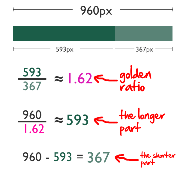
Simple :-)
Still Not convinced... well lets look at twitter.

Look at the boxes.. and how they "fit" the design.. each box is in 1:1:62 with the next biggest element. BTW The spiral is one of the things in nature to look for when looking for the golden ratio.
Right I am going off on a tangent for a moment ..
The Golden Ratio is not quite as fixed a rule as you may think when you start to play around you will discover that you can break the golden ratio if you are careful. There is an optimal number of symbols or characters per line. Generally this is accepted as being 50-60 although up to 75 can be OK. More than this the readers eye wanders off and they loose their place and their interest. Too short and the eye will have to travel back too often, breaking the reader’s rhythm. Too short lines also tend to stress people, making them begin on the next line before finishing the current one (hence skipping potentially important words). SO depending on your typography in your page's elements you can break or at least bend the golden ratio and still provide a balanced design.
There is a very interesting book “Typographie” by E. Ruder that explains a lot about how we read and it seems that the subconscious mind is energized when jumping to the next line as long as it doesn’t happen too frequently. At the beginning of every new line the reader is focused, but this focus gradually wears off over the duration of the line
So with this in mind, sizing your textual elements should combine an optimal line length of between 50 and 60 symbols and nod at the proportions of the golden ratio.
OK Back on proportion
Sine 1:1.618 is pretty close to .33 : 0.66 a variant of the Golden ratio is "The Rule of Thirds" this generally can be used without need for your calculator. All you need to do is divide your design vertically and horizontally into thirds - like a tic-tac-toe board. take this site for example

Now if you remember back to part 1 of this series I pointed out that when people do decide to read a page, their eyes sweep horizontally from left to right, often focusing initially on a roughly triangular area in the upper-left corner. When the results are applied to a page that observes the rule of thirds then we see the following happening.

On the demandware site above you can see that the designer has used the rule of thirds but has nodded at the golden ratio
Also worthy of note in the site example :
1. The picture is placed so the site is in the golden ratio from top to bottom in a similar way to the statue.. the top section is in 1:1.62 to the picture underneath. There is also a golden spiral in there by "weight" in the top 2/3 of the page.

2. The edges of the person's body (not the arms) in the picture runs down the 2/3's line reading left to right or right to left, these are close to the golden ratio and are satisfying to the eye.
3. Whilst the weight of the left hand side is increased by the large ON DEMAND section the page remains in balance because the lower left hand segment is less populated than those on the right so the page remains in balance and is satisfying
4. The package the person is holding is sloped bottom left to top right. This leads the eye up to the navigation panel. Were it the other way around this would drag the eye down to the footer.
..and that is an short introduction to proportion ... another invaluable tool to the designer and will get mentioned again when I talk about "Grids" later in this series.
.. and next we move onto Rhythm ....
No comments:
Post a Comment