Showing posts with label Design. Show all posts

Friday 23 November 2012

The new CSS3 @supports() rule is really rather cool!

As all devs know , browsers can in varying degrees be a right royal pain in the arse when it comes to standards compliance and when you throw in companies like Never Upgrade a PC Till It Breaks Inc. who are still running XP with IE6, planning your super duper new web site to support them can be fraught with problems.

Most of us are used to the idea of designing a UI that degrades into a DBA-UX  (Different But Acceptable User Experience) to do this we have to be able to work out exactly the support for each feature that use in our design and have some "alternate" view that we can switch to.

Up until now I have relied on the wonderful Modernizer.js which smooths out a lot of the inconsistencies between browsers particularly the older rust buckets that NUPCTIB Inc use.

However there is a new CSS rule that will also help you - ladies and gentlegeeks let me introduce @supports() which has the syntax

@supports <supports_condition> { /* specific rules */ }

@supports is supported in most of the current browsers but as you might expect IE has ignored it and Safari doesn't have it yet. If you do use it in your CSS and a browser loads it that does not know what @supports is.. it will ignore the enclosed block, so you can still use your normal methods.

Basically what @supports() does is , it queries the CSS engine for support of whatever it is you need and then invokes the enclosed CSS rules accordingly.

@supports (display: table-cell) { /* some table-cell css in here */ }


Will test the CSS capability for box-flex and apply the rule if it is supported
You can also use a negative test for a rule not being supported.

@supports not (display:table-cell) { /*cope with non support CSS here*/ }

... and you can string together logical NOTs and ORs!

@supports (display:table-cell) and (display:list-item) { /* CSS goes here }

I am sure you get the idea and can see the usefulness of this addition to the Designer's toolbox


Monday 15 October 2012

Principles of Design #6 - Colour Theory, The basics


Right I could wax long an lyrical about colours and how to use them, which I have to say probably sounds odd coming from me given that I am nearly colour blind. However I have been colour blind all my life and to me the sky is blue and grass green because that is what we are taught from when we are small.

Colour is very hard to describe to someone else without using the word "like" in fact most colour names are based around a descriptor that carries with it the meaning of the colour being expressed..

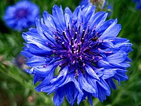
For example "Cornflower Blue" should make you think of the colour of Cornflowers like the one on the left or of a room that was painted with cornflower blue paint. There is no such thing as normal colour vision, we all each and every one bring our own baggage to this quick wander down the garden path of colour theory.


Colour Theory is a BIG topic so I will only be looking at 3 specific areas in this post, areas that any web or app designer needs to have a firm grasp of if they are to produce finished code and colour schemes that are beautiful, pleasing and work within the context of the app you are developing. These topics are .
  1. The Colour Wheel
  2. Colour Harmony
  3. Colour Context
The Colour Wheel

 The colour wheel is one of those things I never see on a geek developers table or in their favourites and yet it is a tool that artists and graphic designers use daily!. Go to any art store and pick one up they will know exactly what you want is you ask for "A Colour Wheel". Alternately you can use one of the many online colour wheels .. this is one I use a lot and can recommend.
http://colorschemedesigner.com/


Color wheels are arranged so that the colours move from red at the top around the rainbow until you come again to the blues and violets at 11pm ish. You will notice that the wheel on http://colorschemedesigner.com has the words WARM and COLD at 1 and 7 o'clock. this does not mean that just the colors at these "times" are Warm or Cold but there is a transition going on from the reds,oranges and yellows which are the colours of fire, embers and the sun convey warmth where greens, turquoises and blues are the colours of grass and water traditionally cool things. But be careful it is transitional and you move from warmer to cooler in gradual steps in each colour.


A color circle, based on red, yellow and blue, is traditional in the field of artists however Sir Isaac Newton was the chap that developed the first circular diagram of colors we know of in 1666. Since then, scientists and artists have studied and designed numerous variations of this concept. Differences of opinion about the validity of one format over another continue to provoke debate. In reality, any color circle or color wheel which presents a logically arranged sequence of pure hues has merit.


Primary Colours: Red, yellow and blue
In traditional colour theory (used in paint and pigments), primary colour are the 3 pigment colours that can not be mixed or formed by any combination of other colours. All other colours are derived from these 3 hues.  When you mix these 3 colours you get the Secondary Colours Green, orange and purple. If you start mixing primary and secondary you get the Tertiary Colours Yellow-orange, red-orange, red-purple, blue-purple, blue-green & yellow-green etc. and so on. gradually as you mix the colours you get the wheel you can see at http://colorschemedesigner.com.


OK I got that colours are colours and they are can be placed on a wheel so how does that help me and why should I use a wheel at all?

Good Question - this is where the next topic comes in

Colour Harmony

In visual experiences, harmony is something that is pleasing to the eye. It engages the viewer and it creates an inner sense of order or a balance in the visual experience. When something is not harmonious, it's either boring or chaotic. At one extreme is a visual experience that is so bland that the viewer is not engaged. The human brain will reject under-stimulating information. At the other extreme is a visual experience that is so overdone, so chaotic that the viewer can't stand to look at it. The human brain rejects what it can not organize because it cannot understand it.. Creating harmony is the task designers need to get right as it delivers visual interest and a sense of order.

The Schemes!
Look again at the colour wheel

The very slime outer ring comprise the primary colors, the inner rings the secondary, terteriary and so on so how do we combine these into a scheme? Well look at the top of the site you will see what at first glance look like odd shaped buttons.

these are the 6 types of standard colour schemes that for want of a better word "work". Look at the one I have highlighted called ANALOGIC, note the 3 dark segments at the top of the circle, these represent colours that are close together on the wheel. If a colour is beside another other colour it is called Analogous (or Analogic) you see this quite a lot in nature and the human brain really quite likes it and accepts it readily and this is perhaps the easiest colour scheme to get right.
If two colours are opposite one another on the wheel they are deemed to be Complimentary and this is another of the scheme names. If you select the Complimentary button on the http://colorschemedesigner.com site you will see this.

Note the appearance of two dots one at 12 o'clock the other at 6, these are the complimentary colours if you drag the dark 12 o'clock dot around the circle the corresponding opposite dot moves with it and the colour scheme displayed on the right of the screen displays a palate of colours that work well together. Note that as you move the dot the palate colours on the left never clash, are never discordant, they "work" - and there-in lies the beauty of the colour wheel!

There are 6 schemes in total and you can explore them at your leisure however I will mention one more the Triadic which combines 3 colours on the wheel in a triangle shape. This can be hard to get right if you do not use a colour wheel!

as you can see you get the dark dot at the top, which you can move around clock wise and anti-clockwise, the two white dots at the bottom form a triangle and these can be dragged as well.. however they broaden or narrow the base of the triangle.Once again the wheel can be used to get colour schemes that work, although some may be a tad garish.. so use with caution!

you will notice that the center of the circle is the colour under the dark dot, this colour will be the one you select as the main colour of your scheme, the others will be secondary to it. hence the larger area of that colour on the right hand palate pane.

Context

How colour behaves in relation to other colors and shapes is a complex area of color theory. Compare the contrast effects of different color backgrounds for the same red square
For most people with normal or nearly normal color vision red appears more brilliant against a black background and somewhat duller against the white background. In contrast with orange, the red appears lifeless; in contrast with blue-green, it exhibits brilliance. Also notice that the red square appears larger on black than on other background colors, this is context! Always try colour swatches of your colour scheme like this to see if they 'work' the way you expect them to and deliver the sort of balance and emphasis that you want to convey.

This is also where I have a problem and http://colorschemedesigner comes to the rescue again notice a the top right there is an option for..... Colour Blind


 Have a look at your color scheme when you apply the different types of colour blindness filters and note how the tonal values change use these options in combination with the preview buttons at the bottom to see how others will see your colour scheme always remember that how you see the context of your scheme is not how others will if they have colour blindness of if there monitor is configured differently from yours. (I am Tritanopy Colour blind have a go and welcome to my world ;-) )

Next post we will go a bit deeper into the world of color and look at hue, luminance and tone

Wednesday 26 September 2012

Principles of Design #5 - Unity, Getting all to work together

Bit of a gap in the series, a 25 mile walk in the Mournes and a couple of projects at work got in the way.. Anyway on with the series - Unity, what is it?

Well that is a hard-ish concept as it sort of suggest that "What works ... works". However it is something that all devs should think about as most of aspire to create things that work and have an identity. Alternately we may work in a company that has a well defined corporate identity framework with in which we create our applications and whilst we work within this framework we may want to add to or improve the framework with our own ideas.

Other frameworks may be very well defined like IBMN's OneUI that we all know and some of us love. I have to add that I am not that keen on it but it does tick a lot of the "design" checkboxes  it is just a bit ... mmmm.... soulless unless you breath some of yourself into it.

Consistency

So in broad terms unity is an umbrella principle for visual design, meaning all aspects of "The Language of Design" that I have talked about so far (and in those to come) contribute to the visual unity of an image. Consistency among parts that contribute to the whole is a hallmark of a unified design. Such parts include color schemes, typography, semantic hierarchy etc. When all of these parts are in sync, the end result is a unified design. However, if one of the parts is inconsistent or improperly applied, unity suffers and the image or site or app often appears disjointed. A common problem that makes a good web site look thrown together.


The site above whilst at first glance looks OK suffers from a lack of consistency, the images do not compliment each other and distract from the design The navigation is confusing and not centred, the colours do not complement each other and the page has no focus which leads nicely into ...

Relationships 

Unity is the relationship among the elements of a visual that helps all the elements function together. Unity gives a sense of oneness to a page as a seen by the user as a single visual. In other words, the words and the images work together to create meaning. So basically don't use a picture of a dog when you are talking about cats or as in the example above have way way way to many unconnected images.

Colour Schemes

I will be talking in a separate post about colour however keeping colour consistent across all the pages or parts of your app.This is where frameworks like OneUI or Twitter Bootstrap come into their own and will help the designer from the get go.

By whatever method you should try to achieve a design that should consistently use a stable color scheme that appeals to viewers. For example, if a Web site consists of multiple pages and the font color for hyperlinks is blue on the first Web page, then hyperlinks should be blue on subsequent Web pages. Also, background colors should be used consistently and should enhance readability preferably by relying on a template or some type of CSS to ensure that page loads are cohesive.

Proximity


The simplest method of making objects or elements on a page appear to belong together is to group them closely together. We humans LOVE patterns and developing a pattern in your design or images will create unity in your design.

Similarity

Things that are the same shape, size, colour or orientation allows the viewer to associate them with each other and visually bind them together.

Repetition

Another method often used to promote unity is the use of repetition. Repetition of color, shape, texture or object can be used to tie a design together. 

Continuity
A much more subtle method of unifying a design involves a trick borrowed from the art community. The continuation of a line, an edge or direction from one area to another. Continuation is often used in books and magazines to tie the elements of a page together with the use of ruled column dividers and by lining up edges of text  headlines and graphics.

Take the picture above the artist has used the continuity of the road to unite the fore-ground with the back ground. The left to right stroked in fore-ground unite the left and right of the picture.

This continuity allows the viewer to start at the front of the picture and work to the back without interruption. The continuity of the stokes allows the view to recognise a pattern that consolidates the idea that we are looking at a "worked" field.

Closure
When you have a group of elements in a design it is important they they are "closed" . By that I mean that the group should be a recognised shape itself and the closure can be achieved with either a boundary line or by whitespace. Have a look at the example below at the 3 panels at the bottom each panel has an image with text below surrounded by white space. This is a "closed" group. Also looking at the 6 panels as a single group bounded by the grey side bars can also be considered as "Closed"

Conclusion


Consider the site above it shows all the elements of unity as a whole - the overall T pattern is easy for the user to identify with. The images work well together the fonts work well and the colour scheme works. This unity allows the elements of the site to be more than the sum of their parts and bind the site into a single pleasant visual experience.

This is what we as design-centric developers need to strive for design not only each element well but ensure that each element works well with every other element on the page.

That brings the principals bit of this series to an end. I hope you found it useful and in the next series of posts I will be talking about how we can leverage these fundamental ideas together with with your current skill sets in the development cycle to both develop and design apps and web sites.

First up is colour in the next post.

Friday 14 September 2012

Design Principles #4 - Use Emphasis to make your point

So in our wander through the skills and ideas useful for devs that do not have design team handy when they are designing apps and sites we arrive at emphasis.

"OK", I hear you cry, "I know all about the [em],[i] and [b] tags."

But emphasis is more so much more that typographical!

Emphasis is what gives you design a focal point and by that I mean that the element that is most important stands out in your design. For this reason emphasis is sometimes called dominance, but I don't want to get all "50 DIVs of Grey" here so I will stick with Emphasis for now.


In the web site above is a classical example of emphasis used to great effect. The rays of light slanting down from top left to the centre and the well lit center image and dark surround create the emphasis and drag the eye to the most important thing on the page. Rembrandt used exactly the same lighting technique all the time... the emphasis is on the lit characters and you find yourself looking at them first and paying more attention to them as a result.

Focal points are very important. In an earlier piece I mentioned the Web Page "Sweet Spot" which was roughly here.
However you do not have to place the focal point here, you can by using emphasis move the focal point to wherever you want on the page.

One of the biggest mistakes I see in design it when the dev tries to make everything in the design stand out or more commonly nothing has emphasis at all. The problem with that is the app will appear busy if too much emphasis is used, and boring and unappealing if not enough is used.

Instead I would recommend using a semantic flow to your HTML markup, a task now made all the easier with the HTML 5 which has changed and will continue to develop towards a semantic rather than presentational markup. Using this new semantic markup as a starting point the developer can arrange the elements of the app or page into a hierarchy.

So your Web page/app will have a hierarchy and all you need to do is put the emphasis on the correct elements so that your design leads the user on a journey you want them to take and hopefully that will be in IBMish an "exceptional experience" ;-) So how do I do it this emphasis thingie

White Space
Remember Emphasis is important but of equal importance is what you de-emphasise!
What I mean by that is the more an element is surrounded by white space or is isolated from other elements, the more weight and, thus, importance it takes on.


In the example above note the "Part of the story" unlike the rest of the page which is space-free this text is emphasised by the the fact it has white-space around it. It jumps from the page and screams "READ ME FIRST" to the viewer.

Contrast
Emphasis can also be leveraged using contrast.

Contrast is about differences: light against dark, small next to large, a portrait-oriented photo next to several landscape-oriented photos. See the contrasts and subsequent focal point on “Love that Summer Feeling” above. The focal point is a rectangle alongside many squares; it is the largest shape on the page; and it also is colorful against a black-and-white backdrop.  This is Contrast pure and simple.

Establish and then break a pattern


In the last post I talked about Rhythm and patterns you can emphasise an element on your design by placing an element at odds with the established pattern on the site. the central item is rotated by 3 degrees clockwise (you can do this really easily with CSS3 *-transform:rotate(5deg); rule). Once again the eye is caught by the weight of the difference and drawn to the centre, the rotation be clockwise draws the eye down to the title "Tie-Dyed". Emphasis hard at work!

Continuance.

Continuance is a fancy way of saying once the eye starts moving it prefers to keep going in that direction until something with more emphasis comes along. Consider this


Even though the bottom splat is bigger and so tends to catch your eye first, your brain can’t help but go “FECK, look at the sexy arrow AND it is pointing right !” Soon enough, you’ll find yourself staring at the smaller object.This is the same effect as you get when someone stops on a crowded street and stares up at the sky, soon a bunch of people will be looking up trying to find what the person is looking at.. (Hint the person looking up is the arrow!!)


Typography

I started with a nod at typography I will do a complete post on fonts in the future so prepare yourself for an attack on the evil that is Comic Sans! But I will add here Fonts can play a bit part in emphasis but do NOT fall into the trap of having lots of different font-faces, sizes, colours and weights. This is NOT good! Use no more than 3 fonts on a page and make very very sure they look good together. Do not,for example mix serif and non serif fonts, on the same page it hurts the eyes! The experience of printers going back to the times of Caxton's printing press should be ignored at your peril!!!

So that was a quick dander through emphasis. It is a very very useful tool for a developer to use, but it is easily misused and can cause chaos , confusion and double-vision in your users! Like all things make it part of your thinking process when planning the site and experiment so you get the right emphasis on the right places.

Look at magazines at other web sites and applications, where is the emphasis? Does it help or hinder? You have your eyes open all day, use them to learn what makes "good" design!!

Next post will be UNITY!

Wednesday 12 September 2012

Design Principles #3 - Getting down to the Rhythm

Rhythm is mentioned by one of my arty farty heros Henri Matisse

An artist must possess Nature. He must identify himself with her rhythm, by efforts that will prepare the mastery which will later enable him to express himself in his own language.
Now Mr. Matisse was taking about paintings but it is equally true about music, poetry or indeed web and app design. We as devs create rhythm by simply repeating elements in predictable or surprising patterns. This repetition is a natural thing that occurs everywhere in our world. As people, we are driven everyday by predictable, timed events. The Olympics every 4 years, telegraph poles along a road, fence posts receeding off down a beach, breakfast coming after gettting out of bed.

Rhythm in design is just re-creating that, re-creating these predictable timed patterns, creating a pleasing sub-conscience relationship between the elements in the pattern.

Humans are designed to seek for and recognise patterns being able to recognise a sabre tooth tiger was a definite advantage to our hairy anchestors!. Patterns are familar and are reasuring to the user, unordered chaos (the opposite of rhythm) jars and unsettles the viewer and should be avoided - unless that IS what you were looking to achieve ;-)
In your app or web site rhythm creates a sense of movement for the user. A good website shouldn’t feel template based, it should tell a story. The fluctuation or repetition  of key elements on a website express rhythm.

So rhythm - tell me more ... there are 3 types Regular, Progessive and Flowing.

Regular Rhythm
Dead easy ...it just repeats elements in timed or predictable intervals like this .. on Play.com

Button equal sized and horizontal, large main image in the area where the eye naturally gravitates, and "KNOCKOUT DEALS!" slap bang in the hot zone of eye movement. Then four small rectangle panels along the bottom. Even these 4 panels have text on the left similar sized image on the right.

All regular, safe , rhythm!

Beware regular rhythm! It can be ... boringly template looking ... if not done well and with some stylistic flair.

Progressive Rhythm
A progressive pattern used changes in size or colour or possesion but not in a regular way. Progessive patterns lead the eye progressively through the elements. In http://flairbuilder.com/ above the asymmetric circles and dotted thread are perfect examples of a Progressive Rhythm leading the naturally from Circle to Circle right to left.

This is particularly skillful blend of regular rhythm in the navigation and footer and progressive in the center panel. It works visually and that is always the acid test of a good design.

Flowing (or Fluid) Rhythm
A flowing rhythm gives a sense of movement, and is often more organic in nature. Think of the stripes on a Zebra, they are regular white and black stripes but arranged in a fluid almost random way. (The rhythm on a Zebra comes the repeating white and black not the size position or shape.)

Flowing is perhaps the most difficult of the rhythms to get right with elements on the page however you can use it to good advantage with your masthead or footer images, which can give the over all impression of a flowing movement on the page.
... and in this website , the sadly now defunct http://www.aw-digital.com

 .. the dev has used a mixture of regular (the stripes top left) and progressive (the semi circular arc) and fluid with the different sized circles. The combination gives a very pleasing effect. Also note there in the top left quadrant the home button.. right where the eye will settle and there diagonally opposite are the "social" buttons balancing the home button nicely.... Lovely!

Adding unique interest and excitement to your web designs can be hard to accomplish, but adding some rhythm to the design is a quick and easy way to do this.Our own demon drummer Bruce Elgort will tell you that good drumming can be the back bone, anchor and driving force in music and as you can see it can be the same in web and app design! Every design has rhythm even if you didn’t plan for it, so a good dev will  take control of it and use it to the best advantage.

.. and so on to how to do "Emphasis" to your app's best advantage in the next design post


Tuesday 11 September 2012

Design Principles #2 - Proportion

Proprotion - OK why should I care about proportion?

Proportion is closely linked to Balance that I discussed in the previous "Design" post. Proportion is one of the attributes that can balance a page or on the other hand send it spinning off into the realm of things that make you go "EUCK!!!!!"

At it's most basic level, proportion is the relationship that an element has with one or more other elements on the page. This relationship can be any one of the elements attributes size, colour, weight (as described in the previous post) but generally it is the size that we humans look for instinctively.

Think of the human body. If you head was 200% wider but the same height it would odd or more correctly "out of proportion" to the rest of your body. The human eye is used to the "natural" proportions found in nature, so while we will instinctively like things that observe certain rules of proportionality we will also dislike and find upsetting those things that are "out of proportion".

Back in the Renaissance artists and mathematicians noticed that there was a natural proportion that when observed made their pictures, sculptures and buildings better, more pleasing and generally visually wonderful!

After much quill sucking and doodling on the back of Italian Bistro table clothes they came to the astounding discovery that the proportion of "nice looking things" was generally the same. They called this the "Divine Proportion" or "Golden Ratio" and it is 1:1.618033988749895 or if long numbers aren't your cup of tea 1:1.618

Eh?
Have a look at the above statues ... which one looks "in proportion"?

If you said the one in the middle .. well you would be right.. here you have the golden mean in action.. the ratio between each adjoining element is in the proportion 1:1.62 .... see?

Right that works for naked men (and women) but what about web pages or apps?

So if you have a page layout that is 906px wide and you want to divide it into two sections that conform to the golden proportion .. easy peasy!


Simple :-)

Still Not convinced... well lets look at twitter.


Look at the boxes.. and how they "fit" the design.. each box is in 1:1:62 with the next biggest element. BTW The spiral is one of the things in nature to look for when looking for the golden ratio.


Right I am going off on a tangent for a moment ..

The Golden Ratio is not quite as fixed a rule as you may think when you start to play around you will discover that you can break the golden ratio if you are careful. There is an optimal number of symbols or characters per line. Generally this is accepted as being 50-60 although up to 75 can be OK. More than this the readers eye wanders off and they loose their place and their interest. Too short and the eye will have to travel back too often, breaking the reader’s rhythm. Too short lines also tend to stress people, making them begin on the next line before finishing the current one (hence skipping potentially important words). SO depending on your typography in your page's elements you can break or at least bend the golden ratio and still provide a balanced design.

There is a very interesting book “Typographie” by E. Ruder that explains a lot about how we read and it seems that the subconscious mind is energized when jumping to the next line as long as it doesn’t happen too frequently. At the beginning of every new line the reader is focused, but this focus gradually wears off over the duration of the line

So with this in mind, sizing your textual elements should combine an optimal line length of between 50 and 60 symbols and nod at the proportions of the golden ratio.

OK Back on proportion

Sine 1:1.618 is pretty close to .33 : 0.66 a variant of the Golden ratio is "The Rule of Thirds" this generally can be used without need for your calculator. All you need to do is divide your design vertically and horizontally into thirds - like a tic-tac-toe board. take this site for example


Now if you remember back to part 1 of this series I pointed out that when people do decide to read a page, their eyes sweep horizontally from left to right, often focusing initially on a roughly triangular area in the upper-left corner. When the results are applied to a page that observes the rule of thirds then we see the following happening.


On the demandware site above you can see that the designer has used the rule of thirds but has nodded at the golden ratio

Also worthy of note in the site example :

1. The picture is placed so the site is in the golden ratio from top to bottom in a similar way to the statue.. the top section is in 1:1.62 to the picture underneath. There is also a golden spiral in there by "weight" in the top 2/3 of the page.


2. The edges of the person's body (not the arms) in the picture runs down the 2/3's line reading left to right or right to left, these are close to the golden ratio and are satisfying to the eye.

3. Whilst the weight of the left hand side is increased by the large ON DEMAND section the page remains in balance because the lower left hand segment is less populated than those on the right so the page remains in balance and is satisfying

4. The package the person is holding is sloped bottom left to top right. This leads the eye up to the navigation panel. Were it the other way around this would drag the eye down to the footer.


..and that is an short introduction to proportion ... another invaluable tool to the designer and will get mentioned again when I talk about "Grids" later in this series.


.. and next we move onto Rhythm ....

Monday 10 September 2012

Design Principles #1 - Balance

So what is "Balance" and why do I give a monkey's chuff?

Well on a very basic level we humans like things to be balanced and something that is visually balanced is more pleasing to the eye than something that is not.

The easiest way is to think of an old fashion set of scales, when the two objects being weighed are the same weight the scales will be balanced. You can have several objects on one side and they still "balance" one big object on the other side.

You will hear design geeks like me say "That panel has too much weight" and basically I am saying the same thing. Visually the panel is heavier than the other elements and is causing the whole effect to be out of balance.

The "weight" of a visual object is made up of its size, color and lightness or darkness. If a visual object on the screen does not "balance" with the other objects on the screen then it drags the viewers eye down to the heaviest part of the screen and you may not be aiming for that effect and it may well detract from the information being presented on other parts of the screen. The weight of an element can be judged using these basic rules.
  • Bigger areas are heavier than smaller areas.
  • Darker areas are heaver than lighter areas.
  • Saturated colors are heavier than unsaturated colors.
  • A stronger border is heavier than no border or a thin one.
  • Texture is heavier than no texture. The denser the texture, the heavier.
  • Colors like red and orange are heavier than calm colors like blue or green.
The human eye is an odd thing it "likes" patterns it can understand easily. The eye understands balance and when faced with something that is out of kilter it will look at the heavy side first as we know that heavy things (in general) carry more importance than light things so in the absence of balance we look for heavy to try and make sense of the imbalance.

We achieve this by scanning a page, painting or website with our eyes looking for balance/imbalance and the thing with the most "Weight". Yahoo! have done some interesting research on tracking the eyes of visitors to various web sites and they have discovered that initially
  • People scan the main (heaviest) part of the page first, this should give us "Context"
  • They make decisions about the page in as little as three seconds based on that scan
  • If they decide to stay, they move their attention to the top half of the screen.
When people do decide to read a page, their eyes sweep horizontally from left to right, often focusing initially on a roughly triangular area in the upper-left corner of a webpage but are dragged towards the "Heavier" parts of the screen or page. Being a designer you can leverage this to your advantage by balancing your page in such a way that you allow your design to lead your users eyes through their visit, both encouraging them to stay and if they do stay making their visit pleasing to look at and use.

There are 3 types of Visual Balance

1. Symmetrical (sometimes called formal) Balance
Symmetrical balance is mirror image balance. If you draw a line down the center of the page, all the objects on one side of the screen are mirrored on the other side (they may not be identical objects, but they are similar in terms of numbers of objects, colors and other elements. Sometimes they are completely identical
Here is a web site that is very nearly completely symmetrical on a vertical access down the middle of the screen. Each side left and right has a similar "weight" and is "balanced".

It is also worthy of note that while the page is balanced Left to Right, it is in a state of imbalance top to bottom. the top is "lighter" and the bottom "heavier". This leads the eye from the top of the page down to the heavier bottom of the page, which is the direction that the designer wants you to take.

Also note the slightly larger tree in the bottom right below "Flexibility", this little bit of imbalance will underline the Flexibility link visually and we will unconsciously be more interested from a visual key in that part of the screen. the designer has done this deliberately to accent the importance they feel in "Flexibility"


2. Asymmetric (Sometimes called Informal) Balance
Asymmetrical balance occurs when several smaller items on one side are balanced by a large item on the other side, or smaller items are placed further away from the center of the screen than larger items. One darker item may need to be balanced by several lighter items.

This example shows an Asymmetric design that it is balanced. The darker right hand panel is smaller that the combined left hand text panels. It is also worthy of note that the eye again is taken from the lighter left most panel through the heavier middle panel and then finally to the left hand heavier panel.


Note in the middle panel the collection of 15 thumnails is at the top.. making the centre column slightly top heavy .. this along with the larger font in the the left hand panel keep the reader's eye in the top half and content rich part of the page.

Although asymmetrical balance may appear more casual and less planned, it is usually harder to to use because the designer must plan the layout very carefully to ensure that it is still balanced. An unbalanced page or screen creates a feeling of tension, as if the page or screen might tip, or things might slide off the side, just as the unbalanced scales would tip to one side.


3. Radial Symmetry
The third type of balance is radial balance, where all elements radiate out from a center point in a circular fashion. It is very easy to maintain a focal point in radial balance, since all the elements lead your eye toward the center.

In this example whilst the designer has nodded at symmetry they have not got it right at all,  the columns are not symmetrical vertically or horizontally. The differences in width are un-balanced, The colours are un-balanced, the lightness/darkness is un-balanced.  You will find your eye scanning up and down left and right in the vain hoping of finding both balance and a place that can be a focus and a place to start.


 So Balance is VERY important in directing your users/visitors to the bits of your app/site you want them to focus on first and then lead them on into content and from their into the depths of your other content.

But BALANCE does not operate in isolation, careful use of proportion helps both balance and allows you to lead the user even more skillfully into your app, and Proportion is what I will look at tomorrow.

Sunday 9 September 2012

Good Design is NOT Expensive!

Goodness Gracious!
I have switched to "Bus" mode - no posts on Dominoyesmaybe for months and then 3 in one day!
I blame UKLUG!
Of I go, have a whale of a time and I come back empowered and enthused by the new things I have come across and new challenges that have been set. This post however comes from the other source of UKLUG benefits, the chats and conversations in the bar after the official bits have finished.

I was chatting with some other devs and the topic of design came up now not the back end application architecture functional design, the front end UI / UX design. It was mooted that this gets ignored a lot for fear of  adding time to the schedule or adding $$'s to the cost of a project and this may be true given the structures we develop in, however I would posit that there is a way were there is minimal additional cost and not that much extra time either.

The answer - simple - teach the devs the principals of design and then we will include those skills naturally as part of the life of a project. Until this happens the phrases ...

"I can't do the arty-farty stuff"
or
"I am not paid to design I am paid to program"
or
"If you want design you need to hire Gok Wan"

... will get trotted out when a project ends up looking the back end of a cow with rampant dysentery.

One of the big positives of a well designed application is that it helps that often fraught problem of "user acceptance". It is no brainer that something that is well designed will appeal to the majority of users whilst something that is badly designed will put them off it from the get go and that is very very important.

We all have a designed thing that makes us go "Wooooo! that is NICE" now look at an application that you have created .. does it make you go "Wooooo! I want to use that" ?.

Design is a big big topic however the thing is that the principals of design boil down to just five elements and they are :
  1. Balance
  2. Proportion
  3. Rhythm
  4. Emphasis
  5. Unity
Now over the next couple posts I am going to explore each one and try to explain what each means and how we are application developers can leverage them to create the same wonderfully useful applications but with that extra bit of  "polish" on the front end.

Sunday 8 November 2009

Now this is an interesting a site - Multicolour Search Site

Now this is an interesting site, it takes several colours you choose and then presents you Flickr images that contain those colours. Now when trying to get a "scheme" for a web site that combines colours or uses what you believe to be challenging colour combinations this is rather useful as you can see if they do work and if the "real" world uses them too.

Mlticolr Search Lab

Disqus for Domi-No-Yes-Maybe