We were having an issue with one of our comms lines the other daywhich resulted in the sudden build up of mail in mail.box on one of the server. Probes were played with an found wanting as they needed someone to be poised Green Lantern like in their inbox waithing for a warning message to appear from a probe that flagged up the problem. In a busy IT dept this is sometimes not possible. What we needed was an app that polled mail.box and when a given limit of mail was passed went "DING" and changed colour.
So it occured to me that there are products outthere like GSX which would do that for me however I have less chance of getting a budget for new software at the minute than I have of becoming Pope! So I thru together this wee app for the ops team which they can open in their borwser and use as a visual and auditory warning of problems before they become really nasty.
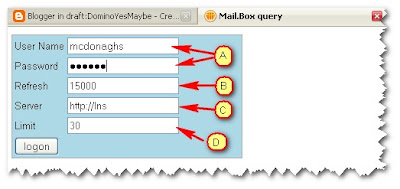
This is what the app looks like
Fig 1. The Logon Screen
(A) Normal Domino Web Logon
(B) Interval the server is polled for data in MilliSeconds
(C) The root of the server URL
(D) The Panic Level at which the app warns the user
Fig 2. The Data and Graph - Normal status
Here the left hand panel shows the result of the last status and the graph the last 9 minutes
Fig 3. The Data and Graph - Limit Passed status
Here is the app having passed the danger threshold of 30 entries in mail.box at this time
the left hand panel has changed to RED and there is also a loudish DING triggered.
This continues until the contents of mail.box return to a level below the panic level.
So.. how is it all done?
Well I get the data using a /mail.box/mail?readviewentries&count=9999 call which returns some nice readable XML that I can parse and get a Grand total, Total of Live mail , Total of Dead Mail,Total of Held Mail and current size of all the mails currently in mail.box. This data I stick in a JS array which builds to a maximum of 100 entries and then then wraps by loosing the last entry and adding the newest at the end.
I use this JS array to build the graph which uses the Buff Graph library [canvas] HTML object (ExCanvas is used for the ever crap IE)
The data refreshed every x seconds depending what you put in the logon screen and the graph will redraw on every 4th data poll.
If you would like to have a play you can download the code here - there is one HTML file and 4 JS files and the DING.WAV file to slip into a folder on the Domino Server's Domino/Data/HTML folder then all you need to do is browse to the server and you are ready to go. If you have any questions just drop me a line


